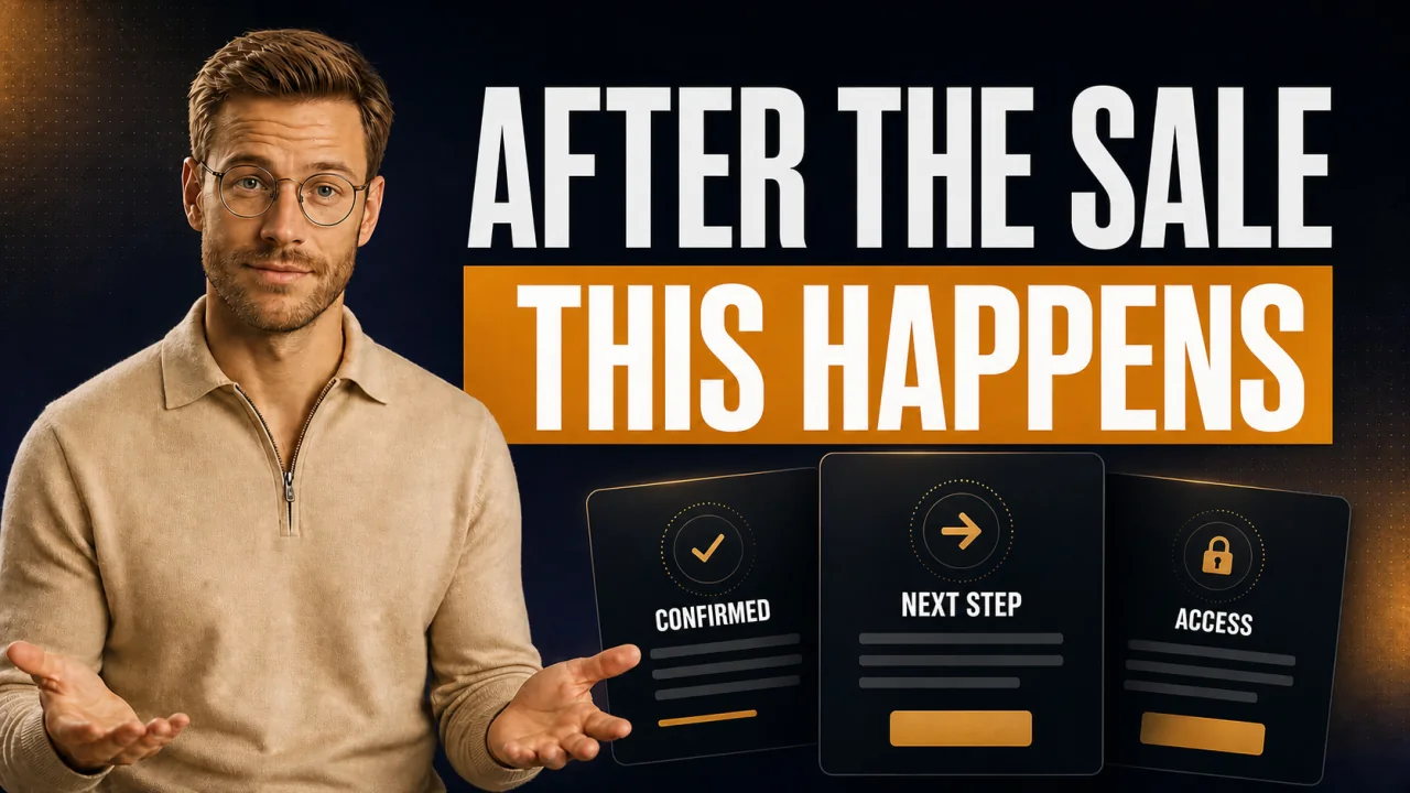
Your customer just paid five figures. And then what? They land on a blank page that says "Payment successful." Your thank-you page is the first moment after the yes, and this is exactly where trust or doubt takes hold. You'll get ready-made templates to copy and real examples you can put to use today.
Show the next step, not just a "thank you." The customer wants to know what happens now, when they get access, and who will reach out. That's exactly what the three templates below deliver.
- A thank-you page doesn't just confirm, it leads to the next step.
- Three ready-made templates: after the call, with an installment plan, with instant access.
- Limit: a template is no substitute for a real onboarding email behind it.
- Build it once, cleanly, and every purchase ends the same reassuring way.
If you only sell 20-euro products through self-checkout, you don't need to read on. This is for high-ticket, four or five figures and up.
What belongs on every high-ticket thank-you page
On an 8,000-euro deal, the purchase isn't an impulse. The customer got on a call with you, negotiated, signed. The thank-you page has to carry that moment.
Let's be honest. Most people just show a green checkmark here. That's a wasted opportunity.
Thank-you page for high-ticket: the first controlled touchpoint after the yes on the call. It confirms the payment and clarifies access, point of contact, and timing before uncertainty sets in for the customer. That clarity is exactly what sets it apart from a plain confirmation page that only shows a checkmark.
Four things belong on it: confirmation, next step, point of contact, timeframe. Leave out the next step and your customer emails you a nervous message two hours later.
Your own thank-you page: for
- You control the entire first impression after the purchase yourself.
- You can link access, appointment, or contract directly.
- It cuts down on questions, because the customer knows right away what's coming.
Your own thank-you page: against
- A nice page is no substitute for real onboarding behind it.
- Too many buttons confuse more than they help.
- Without clear copy, it quickly comes across as generic and cold.
Template: the thank-you page right after the sales call
This is the standard case. The customer said yes on the Zoom call and paid through your High-Ticket-Checkout. Now they need calm and clarity.
Get straight to the point. No long preamble.
A calendar link on the thank-you page brings in noticeably more onboarding appointments. Without a concrete timeframe, even the best purchase suddenly feels non-committal.
Example: thank-you page with an installment plan instead of a one-time payment
Many high-ticket customers pay in installments (represented in CloserCart as "Aufteilung"). On the thank-you page, the first installment has to be spelled out transparently.
This is where most people trip up. They leave out the payment schedule and reap the questions.
The trap: I once had a thank-you page without the payment schedule on it. Three out of ten customers wrote in panicked during the first week, asking whether they'd accidentally paid the full amount.
The fix: I put the next charge, with amount and date, right on the page. The questions dropped off immediately.
How to set up the payment schedule cleanly on the technical side is covered in the guide on creating a payment link. Without the next date, the installment plan feels like a black box.
Example: thank-you page with instant course access
If you sell a course or a community, the customer wants in right away. Every minute of waiting costs momentum. Here the access button belongs at the very top.
Okay, quick aside. "Instant" means truly instant, not "within 24 hours."
My insider tip
I unlock access automatically with the purchase instead of granting it manually. In CloserCart this runs through the Circle integration, and the customer is inside the moment they click. Manual unlocking will get you an annoyed email at eleven at night, guaranteed.
How to tell great thank-you pages from weak ones
I've seen hundreds of confirmation pages. The good ones follow a pattern, and so do the weak ones. Here's the direct comparison.
Great versus weak
| Feature | Great | Weak | Effect |
|---|---|---|---|
| Next step | Clearly named | Missing | Fewer questions |
| Point of contact | Name plus contact | Anonymous | More trust |
| Timeframe | Concretely stated | Open-ended | Calm for the customer |
| Branding | Your own domain | Someone else's brand | Comes across as professional |
The expensive mistake
Don't rely on the default thank-you page of your Reseller platform. It often shows someone else's branding and no next step. On a five-figure purchase, that feels like a rupture and sows doubt at the most expensive moment of all.
The night a thank-you page nearly cost me the customer
I remember it clearly. A customer had just paid 12,000 euros for a coaching program. Everything went smoothly on the call, he was thrilled.
Then he hit my thank-you page at the time. All it said was "Thank you for your purchase" and a small logo. No access, no appointment, no name.
Two hours later the email came. "Hey, I paid, but I don't see anything. Did that even go through?" You could feel the uncertainty in every sentence.
Of course I replied right away and cleared it all up. But the first impression was already damaged. Of all things, right after five figures.
The next day I rebuilt the page from scratch. Access button, success manager with a photo, clear timeframe. Since then, that panic email never came again. It was the cheapest hour of work all month.
Why even the most beautiful thank-you page still gets you nowhere
Everyone talks about design, colors, and buttons. Honestly, that's secondary. A thank-you page is only as good as what happens behind it.
The better metric isn't the look. It's the time from purchase to the first real contact. Call it time-to-value.
Myth
A pretty thank-you page is enough for the customer to feel taken care of.
Reality
The page only sets the expectation. If nothing follows for 24 hours, the feeling flips. Connect the page to an immediate welcome email and a firm appointment. Otherwise that nice button was for nothing.
So don't measure how the page looks. Measure how fast the customer actually gets started afterward. Leave them alone too long, and all that buying energy fizzles out.
What I'd do in the first 7 days
You don't want to overthink the page. Here's the order I'd start with. One step a day is enough.
- Take one of the three templates above and adapt it to your offer.
- Decide what the next step is: appointment, access, or welcome email.
- Put a real point of contact with a name and contact info on the page.
- Connect the page to an automated thank-you email.
- Build it on your own domain, not on someone else's brand.
- Test the entire purchase once with a real payment.
- Ask your next customer how it felt right after the purchase.
The test purchase on day six almost always uncovers a gap. Skip it, and your first real customer finds the bug for you.
Your thank-you page checklist
- Payment clearly confirmed, no jargon
- Next step concretely named
- Point of contact with name and contact info
- Timeframe stated, when what happens
- For installment plans: next installment with amount and date
- Access or appointment linked directly
- On your own domain, no third-party branding
Frequently asked questions about the thank-you page
How do I keep full control over my thank-you page?
Watch three things: your own domain, editable without code, and no Reseller branding in between. With CloserCart you build a custom thank-you page right inside the Checkout, adjust text, button, and link freely, and unlock access automatically with the purchase. Take a template from above as your starting point and adapt the placeholders.
What absolutely has to be on a high-ticket thank-you page?
Four things: confirmation of the payment, the next concrete step, a real point of contact, and a clear timeframe. With installment payments, add the next charge with amount and date. Everything else is trimming. These four points prevent the classic panic email.
Should the thank-you page run on my own domain?
Yes, absolutely. Someone else's brand at the most expensive moment feels like a rupture. How to get your Checkout, including the thank-you page, onto your own domain depends on the provider. For high-ticket, whitelabel isn't a luxury, it's standard.
Is the thank-you page enough or do I also need an email?
Both. The page confirms instantly, the email delivers the details for reference. Customers close tabs, but emails stay in the inbox. Connect the thank-you page to an automated welcome email, and the customer can find their access again anytime.
How do I choose the right payment provider for this?
Make sure you can control the thank-you page, access, and payment method yourself. Reseller models often give you less control. A comparison of the options for coaches and their payment providers helps with the decision. What matters is that the money goes straight to your account.
The technical foundation behind it all, from payment to contract, is bundled in the guide on payment processing for high-ticket.
Custom thank-you page plus automatic access, no tinkering
With CloserCart you build your own thank-you page and unlock course access automatically with the purchase. The customer is inside instantly, with no manual unlocking.
Start now for 1 euro 14 days for 1 euro. Cancel monthly. 0 percent revenue share.